Here's a smaller example of a playblast. Just a short scene, no more than a few seconds long.
Consequently, this scene took only about 5 seconds to playblast.
Nov 14, 2011
Nov 8, 2011
The importance of playblasts
What if you just want to see how your scene is coming along? Maybe you only want to watch the first hundred frames to see if those facial expressions are clear? Maybe you're animating to dialogue and want to see if your lipsync is correct.If your thinking about any of these issues, maybe its time you hit that playblast key. What the playblast does is screen capture each frame and then squeezes it into a video format that you can playback in WMP, VLC, Quicktime (only if you have the quicktime codec), etc. The playblast is based on what your hardware (i.e. video card) can render in real-time. Anyway, seeing the playblast helps you step back from your scene. It also makes it easy to show your colleagues what you've been up to. Finally, playblasting provides you with an efficient form of rendering, meaning one without the bells and whistles ( and time-restriction) of high quality rendering. Now in the example Ive provided, you will see many things. And for those of you with some experience, you'll see that I have made several technical mistakes. The lipsync is off, but that's the beauty of playblast; you can clearly see mistakes! Take a look at this example:
And yes, for those of you wondering, this is a scene from a short film that I was working on. Playblasting was the primary was me and other animators would show each other our scenes and get feedback. Playblast usually create small files, so we easily email them to each other. One caveat to this is that as the scene gets closer to completion, there are more change that the playblast needs to account for. This can mean more frames, more keys and breakdowns, or simply more refined animation curves. This will slow down the playblast, but this method is still light years faster than high quality rendering. The example above is about 24 secs long, which could potentially could takes HOURS to render at film resolution with full color, lighting, etc. The above example took about 10 seconds. So as you can see, playblasts are very useful. They save time when image quality isnt a factor. Playblasts create a compact file that makes it easy to transport thru email or a portable device.
You may also be wondering why Julie, the character in this scene, has no clothes on. NO, I'm not a closet pervert. In order to clothe a character in cg, you have a couple of options. You can either model the clothes as part of the figure (i.e. as if your sculpted the character from clay) or you can use cg cloth. Cg cloth, as you probably guessed, is more render-intensive. And while you can playblast the results of a cloth simulation, it is usually reserved for post production work. In other words, once an entire film has been animated, cloth simulations can be run more accurately since the cloth usually drapes over the geometry that you define as a collider. Cloth simulation opens up a whole can of worms that I think Ill leave for another time.
Aug 4, 2011
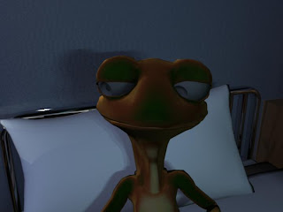
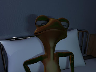
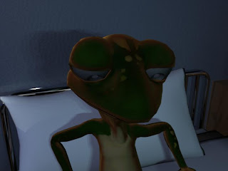
Here's a little something Ive been working on
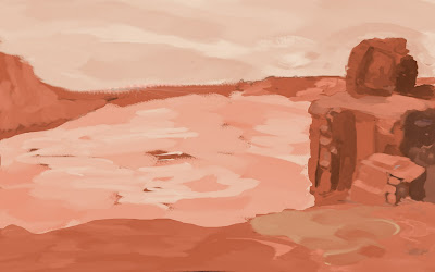
More to come soon. Im trying to teach myself digital painting. I think I have a long way to go (-P My biggest issue seems to be depth. I painted this landscape with perspective in mind, but it still seems flat to me. Maybe this is where I need to pick my color scheme. I know that aerial perspective will play a part in this sketch, but maybe Im not understanding it visually. I know that as an object gets further away from the viewer, its contrast with its surroundings lessens. Many seem to believe that this makes the object's color shift towards a desaturated blue. This seems to make sense with what Ive observed during a cloudless day in the desert. It also coincides with a technique for adding depth-of-field effects to a still image within 3d programs like Maya or 3dsMax. But I've also noticed the higher the viewer is, the further away an object must be before aerial perspective comes into play. I'll have to do some more outdoor sketching to verify this.

May 11, 2011
I thought Id share this. Its on google spain's homepage. The subsequent article tells of Martha Graham and how the animator chose to commemorate what would have been her 117th birthday. Its in spanish, but for those of you into animation, you'll get a kick out of it anyway.
Its at:
www.google.es
Here's a live action video of one of this famous choreographer's pieces:
Martha Graham's "Lamentation"
Its at:
www.google.es
Here's a live action video of one of this famous choreographer's pieces:
Martha Graham's "Lamentation"
May 4, 2011
Jan 26, 2011


Nov 9, 2010
Prequel to my previous post
Ok, in my last post, I got a bit carried away. I went thru all this stuff and jargon that blasted through my fingers like bullets through a machine gun.
In creating the "skin" of 3d animated characters, or any 3d object,you need to apply what is called a material to that object. This material controls how the object responds to light sources that you create in a program like Maya, 3d Studio Max, Blender, etc.
Here is what a standard material looks like(a Lambert shader):
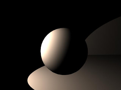
As you can see, the material doesnt respond to light as you would expect. Light is hitting one side and the ground, but no light is bouncing off the ground to "fill" the shadow side of the ball. Also notice how the light seems to fade to black quickly on the ball and on the ground. One more thing: you can distinctly see where the light is the brightest, where it starts fading, and finally , where it stops on the ball. NO light, at least as far as my eyes have seen, reacts this way. As far as our eyes are concerned, there's almost always a seemless transition from light to dark, not including specular highlights (the reflection of a light source on a surface). So how do you change all that? How do you get a material to respond the way YOU want it? Notice that I didnt say, "how do you get a material to respond REALISTICALLY"? That is another topic all together, and one that I will occasionally refer to. But for the most part, I will be talking about how to get a more stylized, simplified look out of your materials.
I have been working on a 3d animated short for 2+ years now. You might be wondering, "Well if its so short, why has it taken 2+ years?" That's a valid question, but the short answer is that in 3d animation, you have to create EVERYTHING. Much like in traditional animation, where multiple artists must draw characters, backgrounds, props, storyboards, etc. to make the film, so too must this happen when creating a fully animated 3d film.
But in addition to that, you have choices to make. What if I dont like that look of the standard materials? What if they make all my characters look like their made of metal or wood, but they are supposed to look like flesh and blood creatures? Well that is where building your own materials comes into play. And it is possible to combine the materials that your 3d software comes with to get different results. You can even build shaders through programming, but that is not how I do it, so dont expect any of that. This is akin to painting hand drawn characters, when combined with textures as well as materials.
Fast forward to now. We start shading our characters with the shaders that come with our 3d software(in this case, Autodesk Maya). This is what we get, roughly:
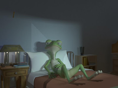
Now some of you may be thinking, "Wow this looks great!" or " This looks like sh**! or even, "I couldnt do that!". Well, that nice. But its not the look we wanted. Its too realistic for what we wanted. Here's an even earlier test just to show what happens in different lighting:
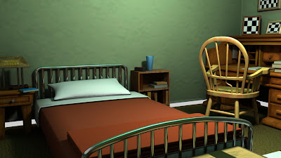
This second image is closer to what the standard shaders ( with some tweaks and textures :p ) will produce. Areas under objects, like the desk or the bed, appear to be black. And yes, areas under objects are usually dark, sometimes they even appear black. Add to this a color scheme that's all over the place and things go haywire FAST! We we're going for a more painterly and illustrative look, and many painters seem to agree that using black to darken your shadows or objects tends to "muddy" the overall image. Now a lot of this information I did not know before I had the specific goal of creating a more simplified look for the film. So we researched painting techniques, color palettes, even other 3d artists, to find a style that we felt was visually pleasing for the film, called "Meteor". And in my off time, I happened to be playing a game who visual style I admired a lot: Team Fortress 2. Here's a painting showcasing Valve's TF2 style:
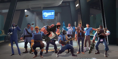
A unified color pallette, clean silhouettes, stylized lighting, iconic characters. Great, sign me up! But being inspired by this look was not enough. We couldnt just "steal" this look. So I wanted to know what inspired Valve's team. That's when I discovered, or re-discovered, an artist whose work has invigorated my own work:
J.C. Leyendecker
A digital version of these paintings doesnt do them justice, but OMG, these are amazing! Blacks arent really black, but cooler colors like dark blues and purples. The skin on these characters looks so vibrant with their warm highlights and cool, not black shadows. That's just the tip of the iceberg, but I now had a clearer vision of where to take the look of the film.
Here's a preview how, with some help from a colleague(Im looking at you, Quio), we re-worked that initial material:
-Pedro S.
In creating the "skin" of 3d animated characters, or any 3d object,you need to apply what is called a material to that object. This material controls how the object responds to light sources that you create in a program like Maya, 3d Studio Max, Blender, etc.
Here is what a standard material looks like(a Lambert shader):

As you can see, the material doesnt respond to light as you would expect. Light is hitting one side and the ground, but no light is bouncing off the ground to "fill" the shadow side of the ball. Also notice how the light seems to fade to black quickly on the ball and on the ground. One more thing: you can distinctly see where the light is the brightest, where it starts fading, and finally , where it stops on the ball. NO light, at least as far as my eyes have seen, reacts this way. As far as our eyes are concerned, there's almost always a seemless transition from light to dark, not including specular highlights (the reflection of a light source on a surface). So how do you change all that? How do you get a material to respond the way YOU want it? Notice that I didnt say, "how do you get a material to respond REALISTICALLY"? That is another topic all together, and one that I will occasionally refer to. But for the most part, I will be talking about how to get a more stylized, simplified look out of your materials.
I have been working on a 3d animated short for 2+ years now. You might be wondering, "Well if its so short, why has it taken 2+ years?" That's a valid question, but the short answer is that in 3d animation, you have to create EVERYTHING. Much like in traditional animation, where multiple artists must draw characters, backgrounds, props, storyboards, etc. to make the film, so too must this happen when creating a fully animated 3d film.
But in addition to that, you have choices to make. What if I dont like that look of the standard materials? What if they make all my characters look like their made of metal or wood, but they are supposed to look like flesh and blood creatures? Well that is where building your own materials comes into play. And it is possible to combine the materials that your 3d software comes with to get different results. You can even build shaders through programming, but that is not how I do it, so dont expect any of that. This is akin to painting hand drawn characters, when combined with textures as well as materials.
Fast forward to now. We start shading our characters with the shaders that come with our 3d software(in this case, Autodesk Maya). This is what we get, roughly:

Now some of you may be thinking, "Wow this looks great!" or " This looks like sh**! or even, "I couldnt do that!". Well, that nice. But its not the look we wanted. Its too realistic for what we wanted. Here's an even earlier test just to show what happens in different lighting:

This second image is closer to what the standard shaders ( with some tweaks and textures :p ) will produce. Areas under objects, like the desk or the bed, appear to be black. And yes, areas under objects are usually dark, sometimes they even appear black. Add to this a color scheme that's all over the place and things go haywire FAST! We we're going for a more painterly and illustrative look, and many painters seem to agree that using black to darken your shadows or objects tends to "muddy" the overall image. Now a lot of this information I did not know before I had the specific goal of creating a more simplified look for the film. So we researched painting techniques, color palettes, even other 3d artists, to find a style that we felt was visually pleasing for the film, called "Meteor". And in my off time, I happened to be playing a game who visual style I admired a lot: Team Fortress 2. Here's a painting showcasing Valve's TF2 style:

A unified color pallette, clean silhouettes, stylized lighting, iconic characters. Great, sign me up! But being inspired by this look was not enough. We couldnt just "steal" this look. So I wanted to know what inspired Valve's team. That's when I discovered, or re-discovered, an artist whose work has invigorated my own work:
J.C. Leyendecker
A digital version of these paintings doesnt do them justice, but OMG, these are amazing! Blacks arent really black, but cooler colors like dark blues and purples. The skin on these characters looks so vibrant with their warm highlights and cool, not black shadows. That's just the tip of the iceberg, but I now had a clearer vision of where to take the look of the film.
Here's a preview how, with some help from a colleague(Im looking at you, Quio), we re-worked that initial material:


-Pedro S.
Subscribe to:
Posts (Atom)